Uploading Images using the Media Library
Overview
In this tutorial, you will learn how to use the Media Library in Core to upload images to your account from within the Core editor that can be used in any of your projects.
Being able to upload images allows you to create UI (User Interface) that is unique for your game that can be used in screen space and world space which can help make your game stand out and improve the player experience.
The focus of this tutorial will be the Media Library and creating brushes from images you have uploaded to the Media Library. Interactive functionality will not be covered, for example, making buttons the player can click on.
- Completion Time: ~20 minutes
- Knowledge Level: No previous knowledge.
- Skills you will learn:
- Where to find the Media Library.
- How to upload images to the Media Library.
- Creating image brushes from content in your Media Library.
- Using image brushes in the UI to create a shop.
Download Image Pack
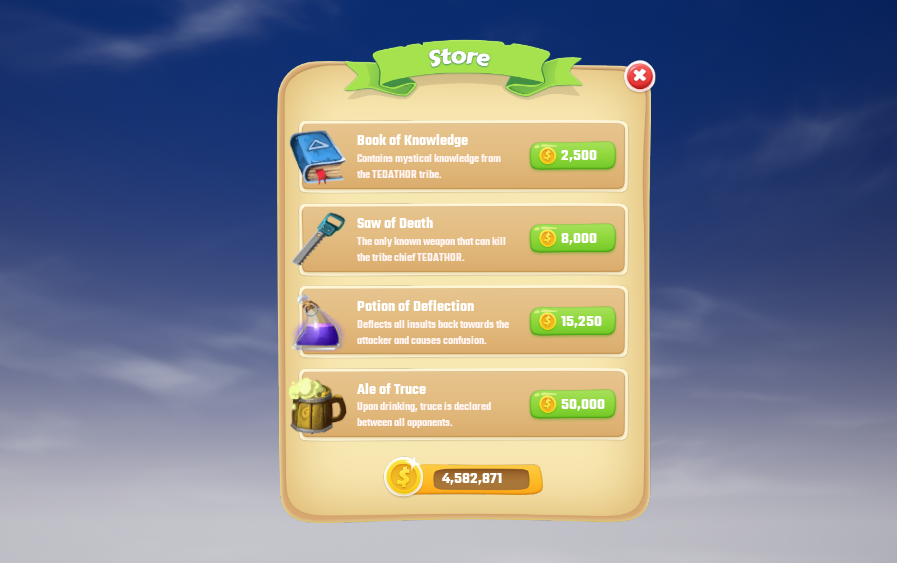
For this tutorial, you will be creating a Shop UI for players to purchase items. You can use your images, or if you want to follow along to recreate the shop UI, then you will need to download an image pack.
The pack below will require you to cut or slice the parts you want to use.
Always check the license that comes with any images you download that you will be using in your project. For the above pack, the license is included with the download.
Uploading Images to the Media Library
To use images in any of your projects, the images need to be uploaded to your Media Library account first. Images that are uploaded to your Media Library account are shared across all your projects. Once the images have been uploaded, you can then create brushes that can be used in the UI.
Open Media Library
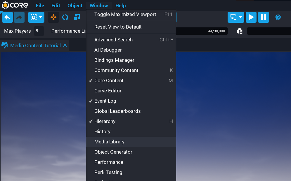
To open the Media Library, go to the Window menu at the top of your Core Editor and select Media Library from the list.
Upload Images
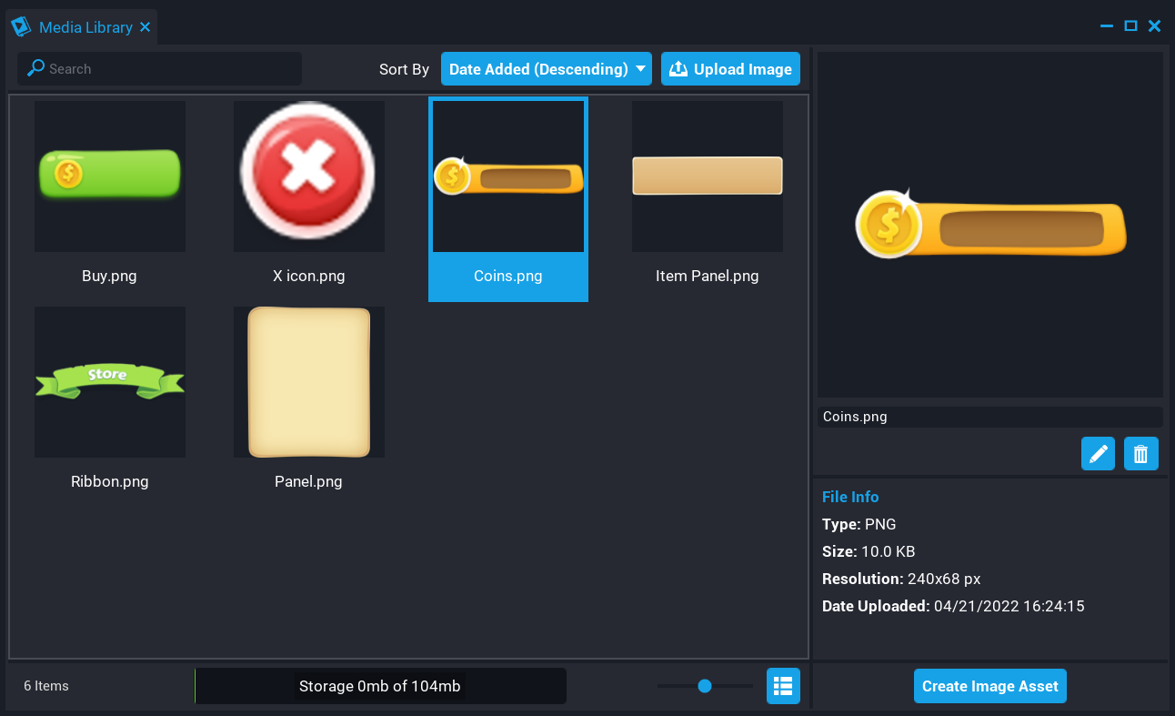
From the Media Library window, select the Upload Image button and upload all the images you want to use for your UI.
In the image below, all the images that will be used in this tutorial have been uploaded.
Creating Brushes
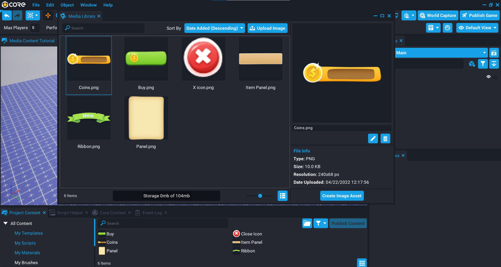
Before you can use an image in your project you will need to create a Brush. A Brush is a usable asset that references the Image Asset on your account.
For each image in the Media Library you want to use in your UI, do the following:
- Click on an image in the Media Library.
- Click on the Create Image Asset button.
When clicking the Create Image Asset button, a new Brush will be created in the folder My Brushes in the Project Content window.
Creating the UI
Now that you have the brushes created, you can start putting together the UI by dragging the brushes into the Hierarchy. If you are using your images, then the placement and scale of your images will be different.
Understanding Aspect Ratio
When using custom images, they will look better when you match their aspect ratio. Each UI Image in the Hierarchy has an option in the Properties window to retain the aspect ratio. Aspect ratio is a proportional relationship between the width and height of an image.
The aspect ratio doesn't need to be manually worked out. When enabling the option Retain Aspect Ratio in the Properties window, Core will retain the aspect ratio regardless of the dimensions set. This allows you to easily control the size of your image using the width or height properties while keeping the correct aspect ratio.
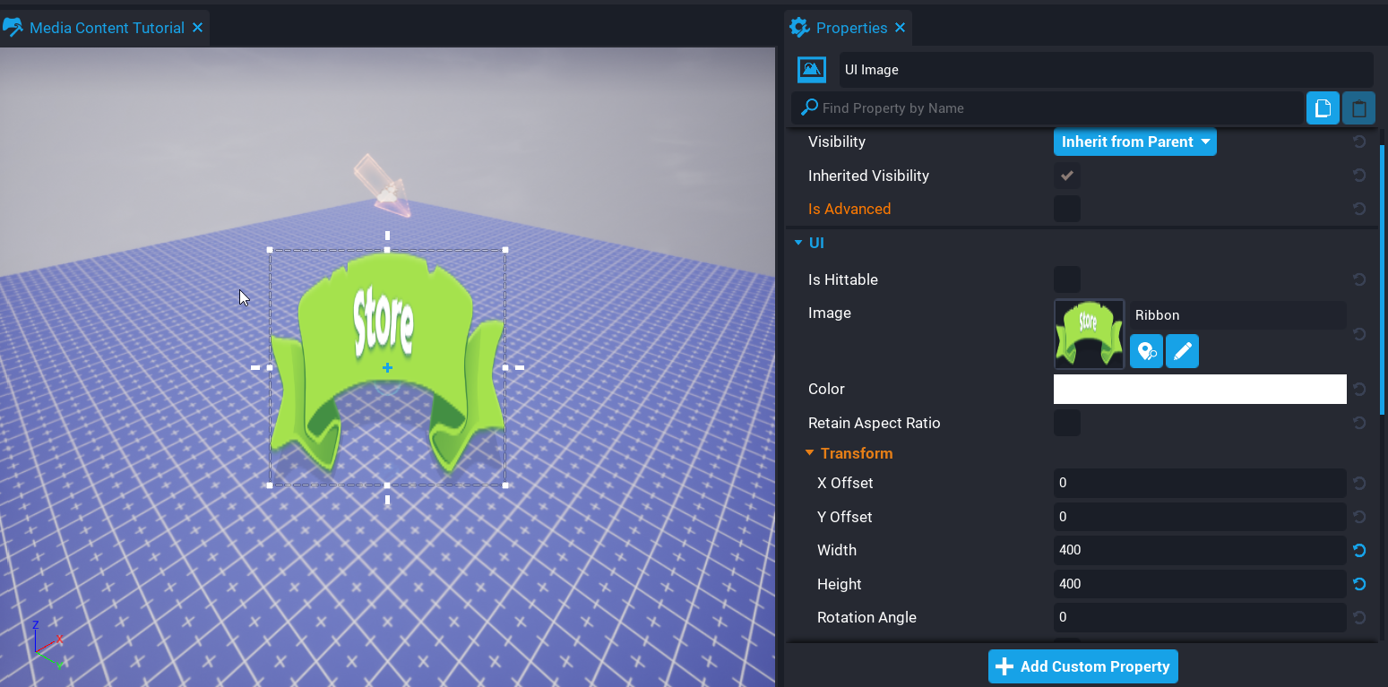
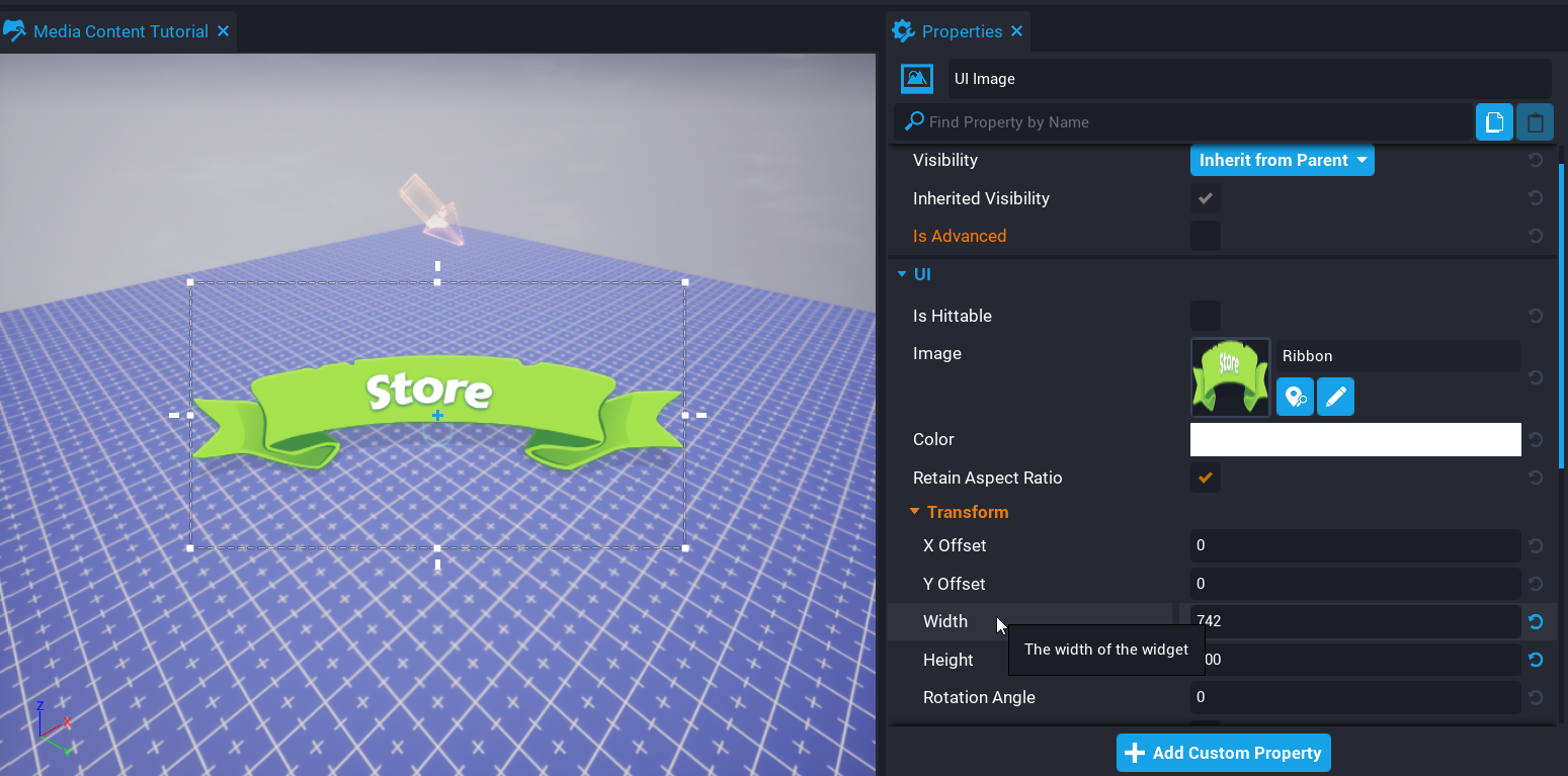 Retain Aspect Ratio Disabled (left) vs. Retain Aspect Ratio Enabled (right)
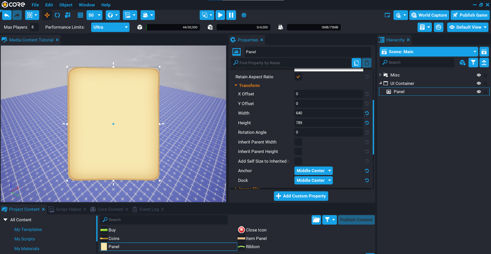
Add Brush for the Panel
The panel will be the base layer for the UI, everything else will sit on top of it.
- Select the Panel brush in My Brushes and add it to the Hierarchy.
- Rename the UI Image in the Hierarchy to
Panel. - In the Properties window, enable the Retain Aspect Ratio option.
- Set the Width to
640and Height to789. - Set the Dock and Anchor to Middle Center.
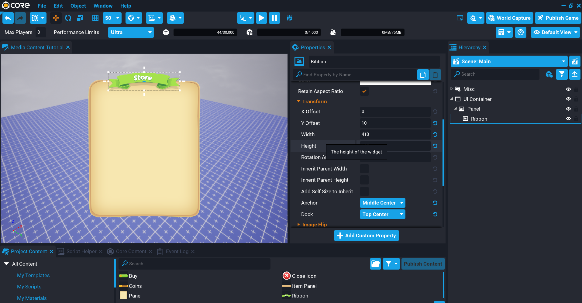
Add Brush for the Ribbon
The ribbon will display at the top of the panel.
- Select the Ribbon brush in My Brushes and add it to the Hierarchy.
- Rename the UI Image in the Hierarchy to
Ribbon. - In the Properties window, enable the Retain Aspect Ratio option.
- Set the Y Offset property to
10. - Set the Width property to
640and Height to789. - Set the Dock property Top Center.
- Set the Anchor property Middle Center.
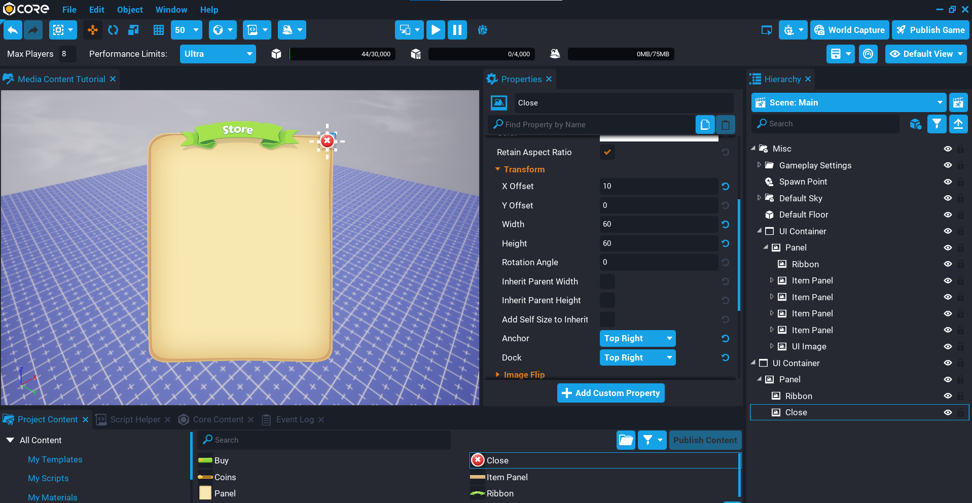
Add Brush for the Close
The close image will display at the top right of the panel and would allow the player to close the UI.
Interactable UI
The focus of this tutorial is not making the UI elements interactable (for example, a button to purchase an item). Brushes can not be used on UI components such as UI Buttons but can be children of the button and a Lua script can be created to handle the button states (for example, hover and unhover) to change the image. For more information about UI click here.
- Select the Close brush in My Brushes and add it to the Hierarchy.
- Rename the UI Image in the Hierarchy to
Close. - In the Properties window, enable the Retain Aspect Ratio option.
- Set the X Offset property to
10. - Set the Width property to
60and Height to60. - Set the Dock and Anchor property Top Right.
Add Item Panel
The item panel will contain the components for the item that players could purchase. This panel will not retain the aspect ratio, as this needs to be a specific width and height.
After you have created all the components of the item panel, you can duplicate it and move it down by setting the Y Offset property. Repeat this for how many items you want to display in the UI. In this tutorial, we will be doing 4 items.
- Select the Item Panel brush in My Brushes and add it to the Hierarchy.
- Rename the UI Image in the Hierarchy to
Item Panel. - Set the Y Offset property to
100. - Set the Width property to
560and Height to125. - Set the Dock and Anchor property Top Center.
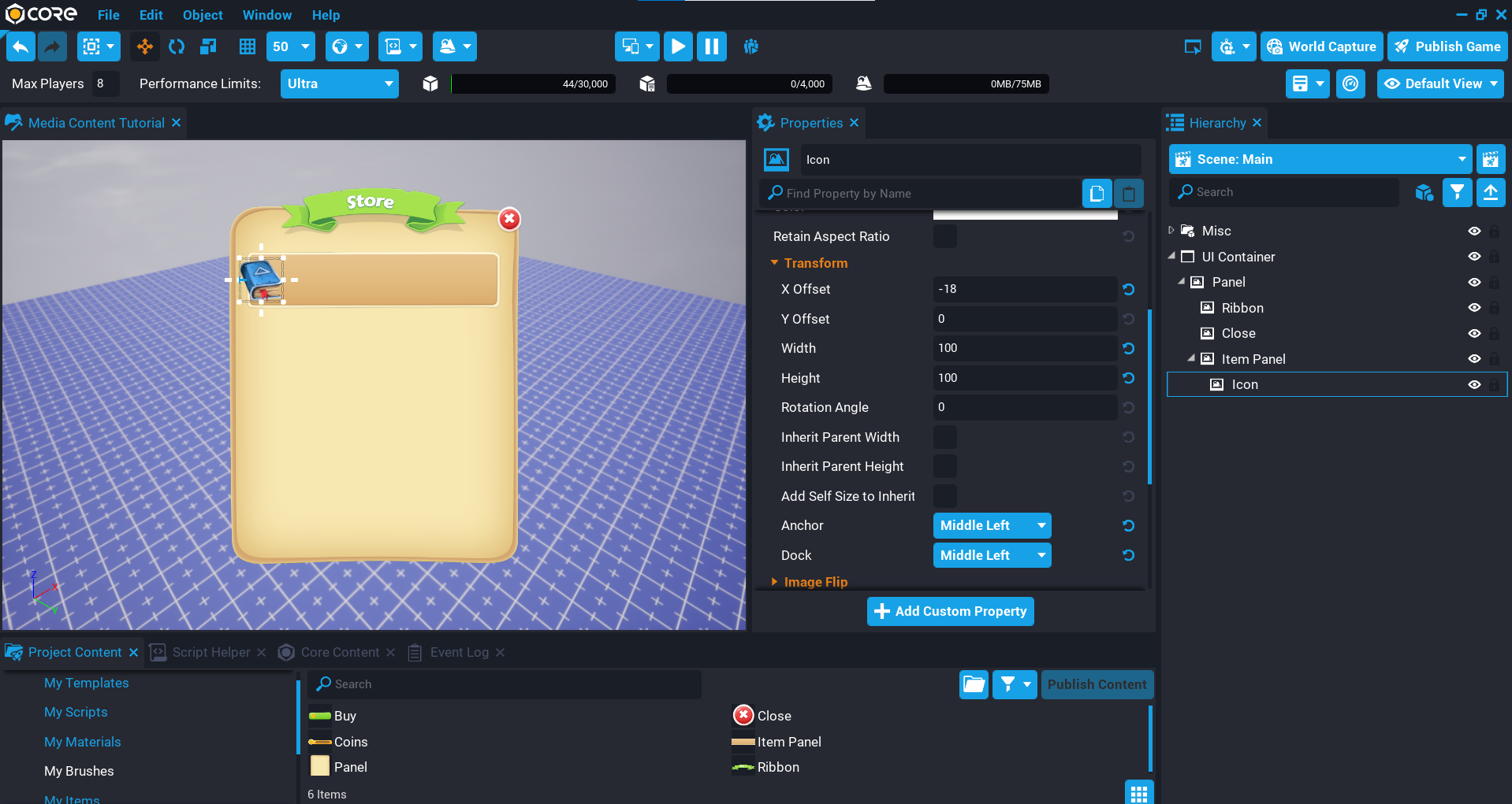
Create Item Icon
The item icon will represent the item the player would receive when the item is purchased.
- Add a UI Image as a child of the Item Panel and rename it to
Icon. - Set the X Offset property to
18. - Set the Width property to
100and Height to100. - Set the Dock and Anchor property Middle Left.
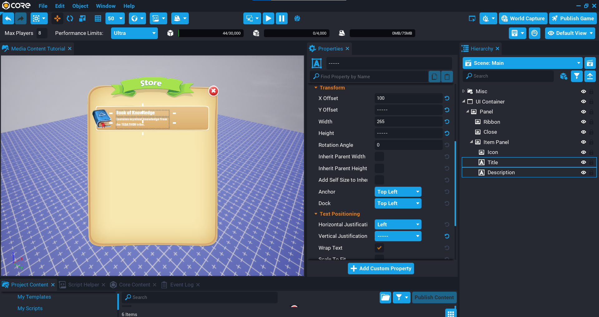
Create Title and Description
The item will need a title and description, so the player knows what they will be purchasing.
Create Title
- Create a UI Text object called
Titlethat is a child of the Item Panel. - Set the X Offset property to
100, and the Y Offset to20. - Set the Width property to
265, and the Height to35. - Set the Dock and Anchor property Top Left.
Create Description
- Create a UI Text component called
Descriptionthat is a child of the Item Panel. - Set the X Offset property to
100, and the Y Offset to55. - Set the Width property to
265, and the Height to60. - Set the Dock and Anchor property Top Left.
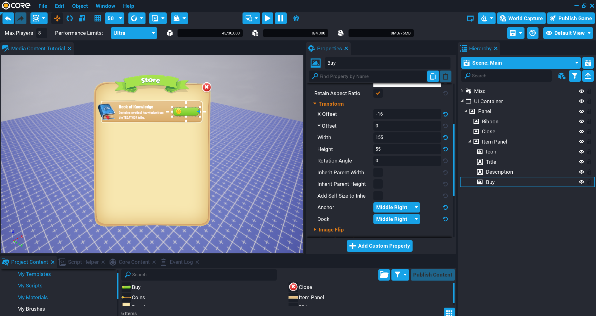
Add Buy Brush
The buy brush will display a button in the item panel and have a UI Text object as a child that will let the player know how much the item costs to purchase.
- Select the Buy brush in My Brushes and add it to the Hierarchy.
- Rename the UI Image in the Hierarchy to
Buy. - In the Properties window, enable the Retain Aspect Ratio option.
- Set the X Offset property to
-16. - Set the Width property to
155and Height to55. - Set the Dock and Anchor property Middle Right.
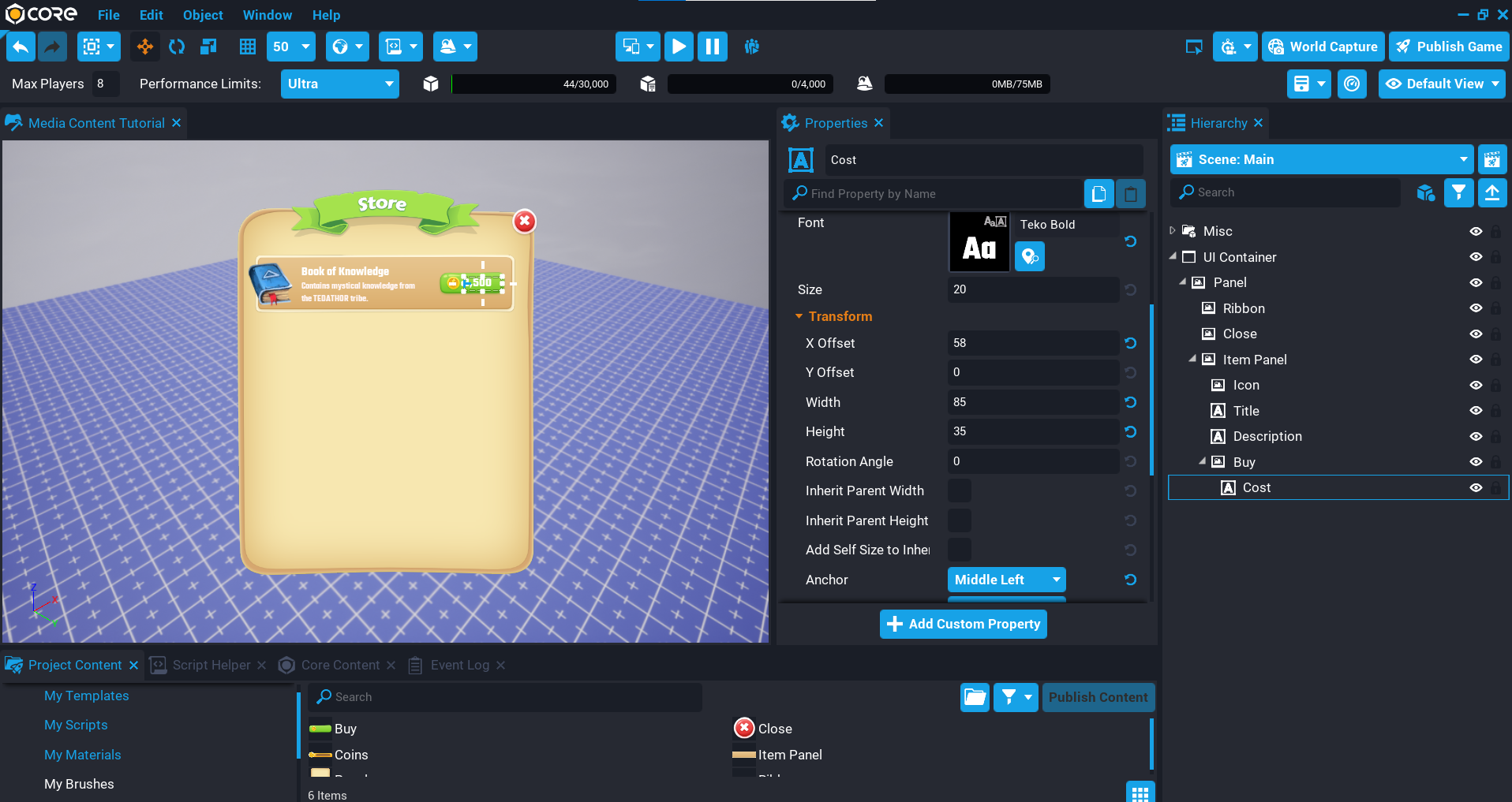
Create Cost Text
The Buy button has space where the cost of the item can be shown.
- Create a UI Text object called
Costthat is a child of the Buy image. - Set the X Offset property to
58. - Set the Width property to
85, and the Height to35. - Set the Dock and Anchor property Middle Left.
- Set the Vertical Justification property to Center.
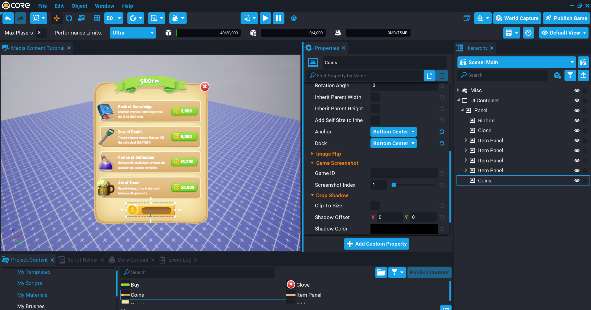
Add Coins Brush
The Coins brush will create a UI image that gives you an area where the player's total coins can be displayed.
- Select the Coins brush in My Brushes and add it to the Hierarchy.
- Rename the UI Image in the Hierarchy to
Coins. - In the Properties window, enable the Retain Aspect Ratio option.
- Set the Y Offset property to
-40. - Set the Width property to
270and Height to78. - Set the Dock and Anchor property Bottom Center.
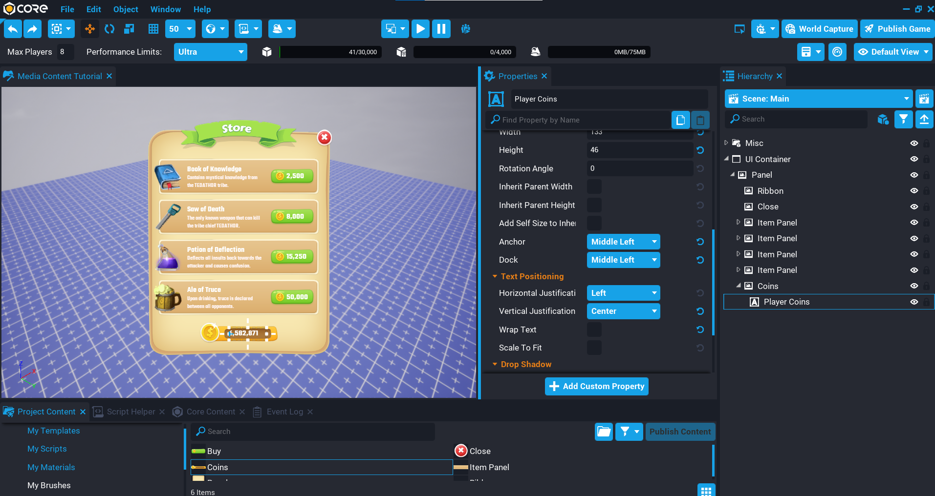
Create Total Coins Text
The coin's image has an area on it where the player's total coins can go.
- Create a UI Text object called
Player Coinsthat is a child of the Player Coins image. - Set the X Offset property to
100and the Y Offset to6. - Set the Width property to
133, and the Height to46. - Set the Dock and Anchor property Middle Left.
- Set the Vertical Justification property to Center.
Summary
With the support for transparency, the Media Library allows you to create a custom UI experience for your players that are unique to your game and theme. The Media Library makes managing your content very easy because it is tied to your account, so all the content is accessible in any of your projects.